Built with intention.
Every decision has a reason.
This page documents the design language, brand identity, and technical choices behind the ZRO Ground Coffee website — from typeface selection to how your logo appears when someone shares your link on social media.
Logo & Icon
The Z Mark
The letterform is a bold geometric Z — representing the "ZRO" in the brand name and the philosophy of starting from zero. The strokes are angular and confident, communicating precision and intentionality.
The Espresso Puck
Centered on the Z's diagonal stroke sits a circle containing a coffee bean — specifically a portafilter puck viewed from above. It anchors the mark in the coffee world without being literal or decorative.
SVG — Infinitely Scalable
The mark is built as pure SVG — a mathematical description of shapes, not pixels. It renders crisply at 16px on a phone screen or 800px on a billboard. No blurring, no artifacts, no resolution limit.
The Palette
Built around the natural tones of roasted espresso: warm near-blacks for depth,
amber-gold for warmth and premium positioning, cream for legibility without harshness.
Notably, the background is not pure black — it has warmth baked in (#120B05),
which makes the whole palette feel inviting rather than cold.
-
Espresso 900
#120B05
Page background
-
Espresso 800
#1C1108
Card surfaces
-
Espresso 700
#271912
Elevated surfaces
-
Amber 500
#C9943A
Primary accent / CTAs
-
Amber 400
#D4A855
Hover states
-
Cream 100
#F5EDE0
Primary text
-
Cream 300
#D4BFA0
Secondary text
-
Cream 500
#A8906E
Muted / metadata
Typefaces
Playfair
Display
google.com/fonts · Serif · 700 / 700 italic
A high-contrast serif with strong vertical stress and delicate hairlines. Signals editorial quality — the typography of food magazines and luxury brands. Used for all page headlines, section headings, and pull quotes.
"Coffee is the medium.
The experience is the art."
DM
Sans
google.com/fonts · Sans-serif · 300 / 400 / 500
A geometric sans-serif designed for digital interfaces. Exceptionally readable at small sizes, approachable without being casual. Handles long-form copy without fatigue. Used for all body text, navigation, and form labels.
We respond within 24 hours. No carafes. No Keurig. Just espresso built around your brand.
JETBRAINS MONO
Used sparingly for section labels (EL PASO'S MOBILE ESPRESSO BAR), hex color codes, and technical metadata. The monospace rhythm creates visual contrast against the two proportional typefaces.
OpenGraph Image
When someone shares a link to your website on Instagram, Slack, iMessage, Twitter/X, LinkedIn, or any other platform, a preview card automatically appears. That card is driven by hidden HTML tags called OpenGraph metadata — and the image it shows is called the OG image.
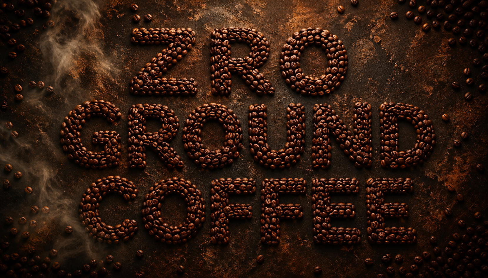
Exact Dimensions
1200 × 630 px
The universal standard across all major platforms. Tall enough to be legible as a thumbnail, wide enough to show brand identity at a glance.
Why This Image
"ZRO GROUND COFFEE" spelled in actual roasted beans. Zero ambiguity about the brand. Memorable. Unique. When someone shares your site, the first thing they see is your name — literally built from your product.
The Code
Every page on this site includes the meta tags that point to this image automatically. You don't have to do anything — sharing any URL from the site will show this card.
What's actually in the page's HTML
<meta property="og:title" content="ZRO Ground Coffee" />
<meta property="og:description" content="Mobile espresso bar and event catering in El Paso, TX." />
<meta property="og:image" content="https://zrogroundcoffee.jjaimealeman.workers.dev/og.jpg" />
<meta property="og:type" content="website" />
<meta name="twitter:card" content="summary_large_image" />Design Decisions
-
Dark as primary, not a toggle
Most coffee sites go light — creamy white, warm beige. We went the other direction. Dark backgrounds signal premium positioning and echo the color of a freshly pulled espresso shot. Every competitor looks like a café menu; this looks like a hotel bar.
-
Warm near-black, not pure black
The background is #120B05 — a near-black with warm brown undertones. Pure black (#000000) is harsh and digital. Warm black feels tactile, like leather or roasted wood. The difference is subtle but felt.
-
Negative space as a feature
Wix templates pack content wall-to-wall. Every section here breathes. White space — in this case, espresso space — communicates confidence. Brands that have room to breathe feel established. Brands that fill every pixel feel desperate.
-
No text in images
Every word on this site lives in the HTML — never baked into a photo. This means Google can read and index every headline, search engines understand the content, and screen readers narrate it correctly. It also means copy is editable without touching an image file.
-
One CTA, repeated clearly
"Book Your Experience" appears exactly as many times as needed — no more, no less. CTA overload (5 different button labels) creates decision paralysis. One clear action, consistently labeled, converts better.
-
Speed at the edge
This site runs on Cloudflare's global network — a server physically close to your visitor, wherever they are. No origin server load time, no CDN delay. The average page load is measured in milliseconds, not seconds. Fast sites rank higher on Google.
The Technology Stack
Site framework
Astro 6
Zero JS by default. Ships only what each page needs.
Styling
Tailwind v4
Utility-first CSS. Tiny bundle. Nothing unused ships.
Hosting & delivery
Cloudflare Edge
Global network. Sub-100ms response worldwide.
Logo & favicon
SVG
Infinite resolution. One file, every size.
"Every technical choice was made to serve the design — and the design was made to serve the business."
Fast site → better Google ranking → more people find you → more bookings. That's the full chain. Every decision on this page connects to that outcome.